Marketing Data Visualization Guide: Strategic Insights & Impact
Introduction: The Imperative of Visual Intelligence in Marketing Analytics

In the contemporary digital economy, the discipline of marketing has undergone a profound transformation, evolving from a fundamentally qualitative endeavor focused on brand building and conceptual awareness into a rigorously quantitative, revenue-accountable engine of corporate growth. Modern marketing departments are explicitly expected to directly contribute to enterprise expansion by filling the new business pipeline, optimizing lead conversion velocities, and maximizing customer retention. Consequently, marketing professionals are perpetually inundated with an unprecedented volume and velocity of data. This information spans the entirety of the complex customer lifecycle, encompassing initial digital ad impressions, click-through rates, intricate multi-touch attribution models, website behavioral analytics, and sophisticated Customer Lifetime Value calculations. However, raw data, whether housed within static spreadsheets, isolated within disparate marketing technology platforms, or residing in vast data lakes, possesses no inherent narrative power or strategic value.
To secure crucial executive buy-in, optimize fluctuating campaign budgets, and definitively communicate the return on investment of strategic initiatives, marketers must master the ability to translate complex, multi-dimensional datasets into actionable, easily digestible insights. This translation mechanism is the science and art of data visualization. Data visualization serves as the graphical representation of information, purposefully designed to condense massive, unwieldy amounts of data into intuitive, accessible formats utilizing visual elements such as charts, graphs, and spatial maps. The primary objective of this endeavor is not merely aesthetic enhancement or decorative reporting; rather, it is focused on cognitive efficiency and strategic clarity.
Effective visualization bypasses the immense analytical friction associated with deciphering endless rows of numbers in a ledger. Instead, it directly engages the human brain’s deeply ingrained pattern-recognition capabilities, instantaneously surfacing underlying trends, statistical outliers, and hidden correlations that would otherwise remain completely obscured. When executed with precision and strategic intent, data visualization functions as a universal corporate language that aligns cross-functional teams, illuminates the friction points within the marketing funnel, and bridges the critical gap between granular analytical findings and high-level, board-ready corporate strategy. This comprehensive research report examines the strategic application of data visualization within marketing analytics. It meticulously deconstructs the foundational frameworks required for appropriate chart selection, explores the cognitive psychology of data storytelling, delineates the advanced mechanics of visualizing complex customer journeys and demographic segmentations, and identifies the critical anti-patterns and design errors that actively erode data trust.

The Cognitive Science and Psychological Foundations of Visual Storytelling
To fully understand the profound efficacy of data visualization, one must first examine the biological and psychological mechanisms governing how the human brain processes information. The human brain’s distinct preference for cohesive narrative structures over isolated, abstract statistics is a product of evolutionary adaptation. Every single day, the brain is forced to take in, filter, and process an overwhelming amount of sensory and informational input. To prevent cognitive overload, it must rapidly determine what information is crucial for immediate processing and long-term retention, and what can be safely discarded. When stakeholders are presented with a cohesive, well-structured data story, multiple interconnected parts of the brain are engaged simultaneously. This includes Wernicke’s area, which is primarily responsible for language comprehension, and the amygdala, which processes emotional resonance and contextual importance. This multi-sensory, whole-brain engagement ensures that critical business insights are not merely observed passively, but are deeply remembered and ultimately acted upon.
Stephen Few, a globally recognized authority on data visualization and dashboard design, posits that the most effective graphical representations rely heavily on four major encodings for numeric values. These foundational encodings indicate positional value via bars, lines, points, and boxes. These specific geometric forms are effective because they leverage pre-attentive processing—the subconscious, instantaneous accumulation of visual information. This phenomenon allows the viewer to instantaneously perceive subtle differences in length, slope, spatial density, and geographic positioning without requiring conscious mathematical calculation. Therefore, professional dashboard design must be viewed as an exercise in informed design rather than artistic expression; it is fundamentally “more science than art, more simplicity than dazzle,” where the ultimate goal is frictionless communication.
The Strategic Framework: A Decision Tree for Chart Selection
A pervasive and highly damaging error in modern marketing analytics is the tendency to select a chart based on superficial aesthetic appeal, software default settings, or a desire for novelty, rather than focusing on the underlying analytical objective. For example, a three-dimensional pie chart might look visually impressive in a presentation deck, but it represents a catastrophic failure of communication if the presenter’s actual message concerns a nuanced trend in monthly recurring revenue over a five-year period. The most robust and defensible methodology for chart selection is the utilization of a question-based decision tree that forces the marketer or data analyst to explicitly define their core message and the nature of their data before plotting a single pixel.
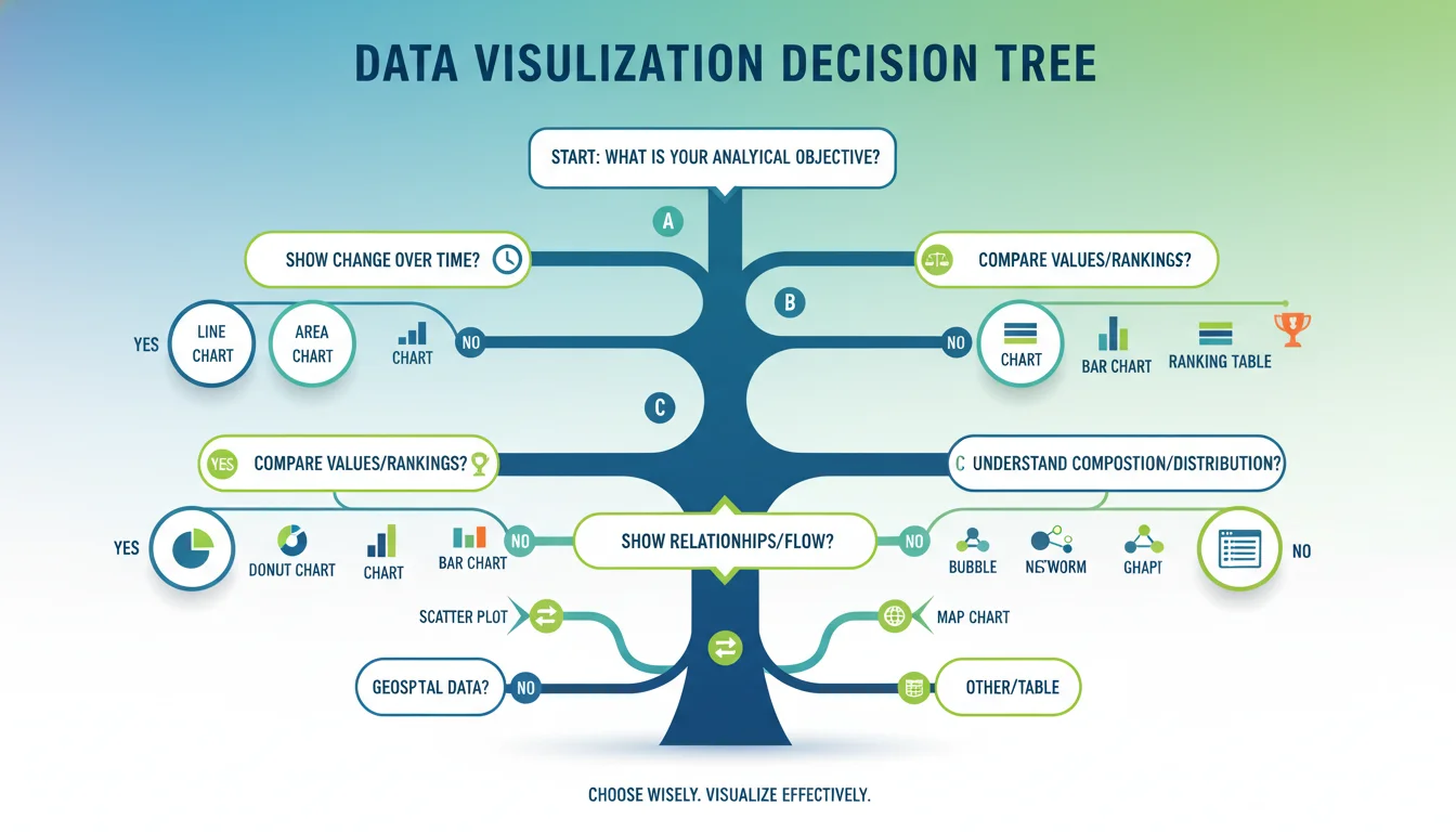
This systematic architectural framework, heavily influenced by tools such as Dr. Andrew Abela’s chart selection diagram and the Financial Times visual vocabulary, categorizes visual selection into primary analytical use cases. The initial step in selecting an appropriate chart invariably involves a thorough understanding of the data itself and defining the specific insight that needs to be showcased. Once the marketer knows their data and their ultimate goal, they can match it to the correct visualization paradigm.
| Analytical Objective | Strategic Description | Optimal Chart Types |
|---|---|---|
| Change Over Time | Demonstrating how a specific marketing metric (e.g., website traffic, lead volume, customer acquisition cost) evolves across chronological periods. This allows analysts to perceive patterns, systemic trends, seasonality, and sudden fluctuations spanning minutes, months, or decades. | Line Chart, Area Chart, Column Chart, Line + Column Chart, Step Chart, Candlestick Chart, Sparkline. |
| Magnitude & Comparison | Evaluating and ranking the relative size, volume, or performance of discrete, independent categories. This is essential for determining which variables are outperforming others, such as comparing total revenue by geographic region, or evaluating lead volume across various paid advertising channels. | Bar Chart, Column Chart, Grouped Bar Chart, Radar Chart, Bullet Chart, Lollipop Chart. |
| Part-to-Whole (Composition) | Illustrating how individual components and distinct segments contribute to a total entity. Marketers use this to display market share distribution, the breakdown of an annual marketing budget, or demographic segmentations within a broader customer base. | Pie Chart, Donut Chart, Treemap, Stacked Bar Chart, Marimekko Chart, Waterfall Chart, Arc Chart, Gridplot. |
| Correlation & Relationship | Uncovering the statistical relationship, or potential causal link, between two or more continuous variables. This objective seeks to answer questions such as whether increased marketing spend correlates directly with increased revenue, or if email subject line length impacts open rates. | Scatter Plot, Connected Scatterplot, Bubble Chart, Sankey Diagram, Network Diagram. |
| Distribution | Understanding exactly how individual data points are spread across a specific numerical range. This is vital for identifying statistical medians, dense clusters, and extreme outliers, such as analyzing the age ranges of a customer base or the frequency distribution of purchase amounts. | Histogram, Box Plot (Whisker Plot), Violin Plot, Density Curve. |
| Geospatial & Spatial | Mapping complex data points onto geographical locations to reveal regional performance patterns, physical supply chain dynamics, or local market penetration. This leverages the viewer’s inherent understanding of real-world physical boundaries. | Geo Heatmap, Scatter Map, Proportional Symbol Map, Choropleth Map. |
By rigorously filtering the dataset through this specific matrix, marketers ensure that the visual output is intrinsically aligned with the exact business question being asked, thereby minimizing cognitive friction and accelerating the time-to-insight for the end-user.
Taxonomy of Marketing Charts: Visualizing Comparisons and Categorical Data
Equipped with the decision framework, marketing analysts must understand the highly specific mechanics, strengths, strict rules of application, and limitations of individual chart types.
The foundation of everyday marketing reporting relies heavily on visualizations designed to compare discrete values.
The bar chart, alongside its vertically oriented counterpart, the column chart, represents the most ubiquitous, foundational, and instantly recognizable tool in the entire discipline of data visualization. In these charts, quantitative values are encoded directly by the length of the bars, with each bar corresponding to a measured group or category. This geometric format provides a highly precise mechanism for the human optic nerve to compare discrete categories, making it the premier choice for displaying fundamental marketing metrics such as total sales by geographic region, revenue generated by specific product lines, or the number of purchases made by different user types.
The application of these charts is governed by strict best practices. Analysts should utilize vertical column charts specifically when the total number of categories is quite small—ideally up to five, but strictly no more than seven categories. If the data features lengthy category names, such as specific, highly descriptive campaign titles or complex audience persona designations, horizontal bar charts are vastly superior. Horizontal alignment provides ample typographic space for the labels to remain legible without forcing the text to be tilted or stacked, which drastically impairs readability. Furthermore, bar charts are the preferred choice over column charts when the number of categories exceeds seven (up to fifteen) or when the dataset includes negative numbers, which are easier to read along a horizontal axis. Crucially, the numerical axis for both bar and column charts must strictly start at zero. Truncating the baseline of a bar chart artificially inflates minor differences, creating a misleading visual narrative that exaggerates growth or decline. Additionally, bars must maintain a uniform width across the chart; growth or disparity should be perceived entirely through the height or length of the bar matching the axis, preventing the viewer from being confused by variations in total area. Analysts are also advised to avoid using distracting pattern lines or crosshatch fills within the bars, relying instead on solid, accessible colors.
When the analytical requirement expands to include multiple grouping variables, the standard bar chart must evolve into grouped or stacked formats. A grouped bar chart enables the direct comparison of data across two different grouping variables by plotting multiple bars adjacent to each other at each location. For example, this is highly effective for comparing quarter-over-quarter revenue across five different regional territories side-by-side.
For highly specialized reporting, particularly within executive dashboards that track progress against predefined marketing goals, the bullet chart is an essential tool. Bullet charts were specifically designed to replace cluttered, space-wasting dashboard gauges, meters, and thermometers. They provide a compact method for comparing a true current value to one or more benchmarks, featuring a central bar representing actual performance overlaid across a qualitative background range (such as poor, satisfactory, and excellent bands), with a definitive marker indicating the target objective. This allows marketing leadership to instantly assess whether a specific initiative, such as quarterly lead generation, is on pace, lagging, or exceeding expectations without requiring deep analytical interpretation.
Tracking Temporal Trends and Time-Series Analytics
When the core analytical objective involves demonstrating change over time, the visual toolkit must pivot to formats that emphasize continuity and trajectory. Visualizing change over time allows marketers to perceive overarching patterns, systemic trends, and seasonal fluctuations that dictate strategic planning.
The line chart is the unequivocal standard and the most effective visual instrument for showcasing changing time series data. By connecting discrete, chronological data points across an ordinal axis, the line chart explicitly illustrates trends, moments of acceleration, and periods of volatility. It is the optimal choice for displaying how a currency exchange rate fluctuates, how monthly digital revenue has grown, or how organic search traffic dips during holiday seasons. The fundamental rule for any chart involving a time dimension—including years, quarters, months, weeks, days, or hours—is that time must invariably be plotted on the horizontal X-axis. Chronology must always run sequentially from left to right, matching the standard cognitive model of time progression, and never from top to bottom.
To maintain legibility and ensure the narrative remains clear, marketers must adhere to strict data-ink ratios when constructing line charts. Analysts should clearly label their axes so the viewer immediately knows what is being evaluated. Distracting chart elements, such as heavy background grids, varying unnecessary colors, and bulky legends, must be removed to prevent distracting the viewer from quickly perceiving the overall trend. Crucially, marketers should avoid plotting and comparing more than five to seven distinct lines on a single chart. Exceeding this limit results in a chaotic, tangled visual affectionately known in analytics as a “spaghetti chart,” which is entirely unreadable and defeats the purpose of visualization. In certain specific cases where a data set fluctuates entirely above zero, zooming in on the Y-axis (changing the scale) makes it easier to read the micro-fluctuations, provided this truncation is clearly annotated to avoid deception.
Area charts function similarly to line charts but fill the geographic space below the plotted line with color. While line charts are optimal for showing the net change in a metric over time, area charts are superior for emphasizing the total volume or the “bigger picture” magnitude of that metric over time. Stacked area charts expand upon this by stacking multiple data series on top of one another, making them exceptionally powerful for showcasing changes in composition over time. A prime marketing example is utilizing a stacked area chart to demonstrate the shifting market share among top industry players or the evolving revenue contributions generated by different product lines over a fiscal decade. However, stacked area charts carry a significant risk of occlusion, where larger data layers obscure smaller, vital pieces of information. They can quickly become a visual mess if too many variables are introduced. Marketers should use them with extreme caution, strictly limiting the chart to no more than three to five categories, and avoiding them entirely if the audience requires an exact, precise mathematical comparison between the individual layers.
Deconstructing Compositions: The Nuances of Part-to-Whole Relationships
Marketing departments are frequently required to explain how total budgets are allocated, how entire markets are segmented, or how diverse regional sales contribute to global revenue. These part-to-whole relationships require specialized visualizations that represent proportional distribution.
The pie chart, alongside its close variant, the donut chart, represents the most common, yet most frequently misapplied, method for showing part-to-whole data. These charts encode data using the geometric angles and the total area of a circle to represent percentage distributions. The inherent flaw in these charts stems from human biology; the human optic nerve and brain are highly inefficient at accurately estimating and comparing differences in angles and two-dimensional areas compared to their ability to compare linear lengths in a bar chart. Consequently, comparing the precise size of similar segments within a pie chart is inherently difficult, leading to a high frequency of bad data visualization examples. A pie chart featuring twelve thin slices of similar size is considered a catastrophic visualization failure.
Therefore, pie charts must be governed by strict rules.
Visualizing Part-to-Whole Relationships
They should be reserved exclusively for displaying simple compositions—never for complex distributions or exact cross-comparisons. Ideally, a pie chart should contain no more than two to four distinct slices, such as visualizing a binary demographic split or a clear market duopoly. Furthermore, the percentages represented in a pie or donut chart must unequivocally sum to exactly 100%. A frequent anti-pattern in marketing reporting involves analysts omitting specific categories that seem unimportant, leaving out pieces of data, and forcing the audience to do complex mental calculations. For instance, showing a pie chart where California represents a massive slice, but only including the top five regions rather than the entire national dataset, artificially overemphasizes California’s true importance to the organization by manipulating the denominator.
Treemaps
When faced with complex, hierarchical part-to-whole relationships that exceed the capacity of a pie chart, modern analysts rely on the treemap. Treemaps display immense amounts of hierarchical data utilizing nested rectangles, where the surface area of each rectangle is directly and strictly proportional to a specified numerical measure. This format is incredibly space-efficient, allowing marketers to visualize massive datasets. In practice, a treemap can bring complex audience segments to life by simultaneously showing the relative size and the total monetary value of dozens of micro-customer segments within a single visual boundary, guiding highly targeted messaging efforts.
Waterfall Charts
Additionally, the waterfall chart provides a specialized, highly narrative approach to part-to-whole data. A waterfall chart is exceptionally useful when demonstrating how an initial positive value is systematically affected by a series of positive and negative intermediate components, ultimately resulting in a final total. In marketing finance and operations, a waterfall chart is the premier tool for illustrating net revenue accretion and erosion, plotting initial gross sales on the left, followed by downward steps representing customer churn, ad spend, and operational costs, offset by upward steps representing upselling and cross-selling, culminating in the final net profit margin on the right.
Uncovering Correlations, Relationships, and Data Distributions
When marketing analysts move beyond basic reporting and attempt to determine if a statistical relationship exists between distinct variables, they must utilize correlational charting.
The Scatter Plot
The scatter plot represents the standard, definitive method for showcasing the relationship between two continuous variables. By plotting individual data points along an intersecting X and Y axis, analysts can instantly identify positive correlations, negative correlations, dense behavioral clusters, and significant statistical outliers. A classic marketing application of the scatter plot involves plotting campaign marketing spend against total generated revenue to calculate the efficiency frontier of advertising scale. Another highly practical application involves email marketing optimization: plotting the exact word count of email subject lines against the resulting open rates. While looking at endless rows of this data in a spreadsheet makes patterns impossible to see, a scatter plot immediately reveals the clear pattern—a “sweet spot” clustered heavily between four and nine words, demonstrating that shorter lines consistently perform best.
The Bubble Chart
The bubble chart operates as an advanced evolution of the scatter plot, designed to add a critical third dimension to the analysis by varying the physical size (radius) of the plotted circles according to a third variable. This allows for the simultaneous analysis of three distinct KPIs within a single graphical framework. For example, a growth marketing team could plot multiple different audience segments by their overall conversion rate on the X-axis, their click-through rate on the Y-axis, and represent the total budget allocated to that segment via the overall size of the bubble. If the bubbles are very similar in size, direct data labels must be applied to prevent confusion.
Statistical Distribution Charts: Histograms and Density Curves
To understand precisely how data points are spread across a specific numerical range, analysts must deploy statistical distribution charts. Histograms are utilized when a variable is quantitative and takes numeric values, grouping those numbers into specific continuous “bins” to show the frequency of occurrence. This technique is highly recommended for analyzing the distribution of customer age brackets to identify the largest purchasing demographic groups, or for an e-commerce platform to identify the most common median purchase amounts among diverse segments. Alternatively, a density curve can be applied as a smoothed, continuous estimate of the underlying distribution.
Comparative Statistics: Box and Violin Plots
For advanced comparative statistics, such as those utilized in rigorous A/B testing, the box plot (or whisker plot) and the violin plot are essential. A box plot is a highly structured way of comparing distributions between multiple groups by summarizing the statistics—highlighting medians, quartile ranges, and specific outliers. A violin plot provides similar comparative power but plots a symmetrical density curve for each group, providing a highly nuanced view of the exact distributional shape. These charts are critical for ensuring that a seemingly successful marketing campaign isn’t merely being artificially inflated by a handful of extreme outlier purchases, but represents a genuine shift in the median behavior of the target audience.
Visualizing the Architecture of the Marketing Conversion Funnel
The concept of the conversion funnel is a foundational metaphor in marketing, providing a theoretical visualization of the sequential path a potential customer follows from their initial, top-of-funnel contact with a brand through to the final, bottom-of-funnel conversion. Because identifying pipeline leaks and relentlessly optimizing conversion rates are primary mandates for any modern marketing department, the visualization and continuous analysis of this funnel represent a critical discipline.

The AIDA Framework Stages
A modern, data-driven conversion funnel is typically modeled upon the traditional AIDA framework (Awareness, Interest, Decision, Advocacy), which segments the complex customer journey into four highly distinct, measurable stages.
Firstly, the Awareness stage (Top of Funnel, or TOFU) is designed to attract a broad audience, prioritizing brand education and recognition rather than aggressive sales tactics. Users in this stage are seeking information, and marketers reach them via SEO, content marketing, and public relations. Visualizations dedicated to this stage focus heavily on macro-volume metrics: total website traffic, ad impressions, social media reach, and click-through rates. Secondly, the Interest and Consideration stage (Middle of Funnel, or MOFU) focuses on building trust and positioning the brand as a credible authority, often exchanging in-depth content like whitepapers for user contact information. Here, dashboards pivot to tracking intermediate metrics: lead generation rates, webinar sign-ups, email subscriber growth, and overall time spent on page. Thirdly, the Decision and Conversion stage (Bottom of Funnel, or BOFU) deals exclusively with highly qualified leads who are ready to make a purchase. Messaging here is aggressive and value-driven, and visualizations must track hard financial indicators: overall conversion rates, Cost Per Acquisition (CPA), shopping cart abandonment rates, and trial sign-ups. Finally, the Loyalty and Advocacy stage (Post-Funnel) focuses on retaining acquired customers, visualizing metrics such as Customer Lifetime Value , repeat purchase rates, Net Promoter Scores (NPS), and churn velocity.
The Standard Funnel Chart
To effectively manage this complex journey, marketers must employ specialized visualization types that accurately represent sequential attrition. The standard Funnel Chart is a classic visualization that explicitly displays the absolute number of users surviving at each subsequent stage of the process, visually narrowing as the population inevitably decreases. To design a valid funnel chart, analysts must adhere to rigorous best practices. The stages must be ordered with strict logical chronology. The total stage count must be kept reasonable; a funnel containing more than eight to ten micro-stages becomes overly cluttered and impossible to decipher. Crucially, the geometric width of each funnel segment must be directly and mathematically proportional to its true underlying value. Furthermore, superior funnel charts annotate not just the raw numbers, but clearly display both the overall, top-to-bottom conversion rate and the highly specific stage-to-stage conversion rates, allowing analysts to instantly pinpoint where the most severe drop-offs are occurring.
However, standard funnel charts operate on the flawed assumption that the customer journey is perfectly linear.
In reality, modern digital journeys are highly fragmented and cyclical. To map this complex reality, analysts utilize Flow Diagrams and Sankey Diagrams. A Sankey diagram illustrates the various, multi-touch paths users navigate through a digital ecosystem, mapping entry points, cyclical behaviors across different marketing channels, and exit nodes. It can reveal exactly how demographic-driven channels contribute to ultimate conversions, using continuous, branching lines where the width of the line is proportional to the traffic volume flowing through that specific path.
At the absolute micro-level of conversion optimization, marketers utilize Heat Maps. Heat maps overlay web pages, using varying color gradients to indicate the exact coordinates where users are clicking, resting their mouse, or failing to click. This provides UX and UI marketers with direct, undeniable visual evidence for optimizing page layouts, identifying layout friction, and repositioning call-to-action buttons for maximum impact.
Strategically, it is vital to note that the cadence and structure of funnel analysis differ radically depending on the business model. Business-to-Business (B2B) funnels are characterized by extended sales cycles involving multiple enterprise stakeholders, driven by logic, ROI calculations, and heavy educational content. Consequently, B2B visualizations focus heavily on pipeline velocity and complex lead scoring. Conversely, Business-to-Consumer (B2C) funnels are significantly shorter, highly volatile, emotionally driven, and reliant on brand perception and immediate social proof. Effective funnel management across either model requires a unified data approach, seamlessly combining insights from web analytics platforms (like Google Analytics using Enhanced E-commerce tracking), Customer Relationship Management (CRM) tools, and native ad platforms to achieve a complete, unfragmented picture of performance.
Geographic mapping and Demographic Audience Segmentation
Understanding the nuanced behaviors of specific audience segments, and mapping where those highly valuable customers geographically reside, requires moving beyond simple two-dimensional bar charts into the realm of multivariate and spatial data visualization. Advanced segmentation strategies allow modern marketing teams to reach their audience with highly personalized, relevant content, significantly increasing the probability of conversion in a crowded digital marketplace.
When a dataset contains inherent locational metadata—such as customer zip codes, GPS coordinates, shipping addresses, or IP addresses—geographic maps have the unique ability to unlock patterns that are completely invisible in standard charts. Geospatial visualization involves plotting these data points directly onto geographical boundaries to reveal spatial relationships, sales territory performance, and localized supply chain dynamics.
A primary technique for geographic visualization is the Choropleth map, which utilizes varying color saturation within predefined political or regional boundaries (such as states, counties, or countries) to represent variable metrics like total sales volume or demographic density. A Geo Heatmap (or density heatmap) offers a more fluid alternative by discarding rigid borders. Instead, it applies a density-based radial color gradient to highlight regional “hot spots” of activity, effectively demonstrating areas of high and low concentration, regardless of arbitrary state lines. A national sales manager can deploy a geo heatmap to instantly see sales concentrations across the country, rapidly identifying top-performing urban centers alongside deeply underperforming rural regions.
The immense narrative power of geospatial visualization is deeply rooted in historical precedent. In 1854, John Snow created a foundational dot map visualization detailing a severe cholera outbreak on Broad Street in London. By using small bar graphs on city blocks to mark the precise number of household deaths, the visualization brilliantly clustered the fatalities around a single, contaminated public water pump, instantly proving the source of the outbreak through pure visual clustering. Similarly, Charles Joseph Minard’s map detailing Napoleon’s disastrous 1812 military campaign in Russia is widely celebrated as one of the most masterful, multi-dimensional data visualizations ever created. Minard’s map simultaneously visualizes physical geography, the sheer volume of troops (encoded by the width of the line), the direction of movement (encoded by color), and the plummeting winter temperatures on the devastating return journey. Modern spatial-temporal hotspot analysis applies these exact foundational principles to contemporary business problems, tracking dynamic variables—such as shifting ride-share demand, vehicular collisions, or mobile app usage—across both geographic space and chronological time cycles.
To bring demographic cohorts to life within a marketing report, analysts utilize an array of targeted visualizations to generate actionable insights. Icon Arrays (or Pictograms) are highly effective for displaying simple demographic splits, survey results, or yes-or-no data. They utilize grids of simplified vector icons (such as human silhouettes) to represent whole numbers or proportions in a highly engaging, accessible format. However, analysts are explicitly warned to avoid icon arrays when dealing with massive, uneven datasets, as generating a grid of tens of thousands of icons becomes visually cluttered, and rounding the numbers can be deeply misleading. A comprehensive demographic dashboard blends multiple techniques: it might feature a histogram to demonstrate the age distribution of the customer base (revealing a median age), a series of grouped bar charts to compare the specific purchasing behaviors of different education levels, and a treemap to simultaneously visualize the relative size and total monetary value of deeply specific psychographic segments.
The Psychology, Strategy, and Accessibility of Color
Within the discipline of data visualization, color must never be viewed as a mere decorative overlay; it is a fundamental, highly technical encoding mechanism that carries profound cognitive weight and psychological implication. Used wisely and with strict purpose, color effectively guides the viewer’s eye, clearly differentiates complex data sets, and triggers immediate emotional comprehension. Used recklessly, color creates overwhelming visual noise, actively confuses the narrative, and systematically misleads stakeholders, turning what should be a clear insight into an unsolvable puzzle.
Professional data visualization relies on three highly distinct classifications of color palettes, each strictly mapped to the mathematical and structural nature of the underlying data being presented.
Qualitative Palettes
Firstly, Qualitative Palettes (also known as categorical palettes) are utilized exclusively when plotting discrete, categorical variables that lack any inherent numerical ordering—such as distinct social media platforms, global countries, or independent product lines. The colors within a qualitative palette must be highly differentiated in hue (e.g., blue, orange, green) to establish distinct identities without falsely implying any hierarchy or sequential relationship. A fundamental, unbreakable rule of thumb in qualitative color design is to strictly limit the maximum palette size to ten or fewer distinct colors—ideally five to six. Exceeding this limit forces the human brain to struggle with subtle hue differentiation, causing massive cognitive fatigue. If a dataset contains twenty distinct categories, the analyst must bundle the smallest, least significant values together into a single, unified “Other” category to preserve visual integrity.
Sequential Palettes
Secondly, Sequential Palettes are applied to continuous, ordered numeric data that progresses from low values to high values—such as fluctuating dollar amounts over time, varying population densities, or escalating click-through rates. These palettes employ a single base hue (or two closely related hues) that transitions smoothly through varying, strictly ordered levels of lightness and saturation. This gradient allows viewers to quickly and intuitively grasp increases or decreases in a single metric without constantly cross-referencing a legend.
Diverging Palettes
Thirdly, Diverging Palettes are deployed when the dataset exists on a spectrum that features a critical, mathematically meaningful midpoint, such as zero. Common marketing examples include mapping profit versus loss, analyzing positive versus negative brand sentiment, or tracking performance above or below a specific baseline target. Diverging palettes utilize two highly contrasting hues at the absolute extremes (for example, deep red for severe financial loss, and deep green for high profit), which gradually converge upon a neutral, muted color (such as white or light gray) in the absolute center of the data spectrum.
Beyond mathematical mapping, colors act as incredibly powerful cognitive shortcuts due to deeply ingrained cultural, biological, and psychological associations. Blue consistently conveys trust, stability, and calmness, making it a universally safe, heavily utilized choice in financial reporting and corporate dashboards. Red universally triggers a psychological response of urgency, danger, stopping, or financial loss. Consequently, red should never be used simply as a primary brand color in an analytical dashboard unless it is specifically deployed to denote a critical metric requiring immediate corrective action, such as a spiking customer churn rate or a severe budget overrun. Conversely, green is inherently linked to physical growth, positive strategic outcomes, and financial gain. Strategic dashboard design aggressively leverages these automatic associations.
Utilizing a bright green to denote revenue growth and a stark red to highlight declining metrics perfectly aligns with the preconceived expectations of executive stakeholders, facilitating instantaneous pattern recognition. When comparing specific platforms, analysts can also use color to trigger brand associations; for example, contrasting a light blue line (representing Facebook ads) against a pink-purple line (representing Instagram ads) uses the platforms’ native branding to make the chart instantly legible.
Crucially, an often-overlooked mandate in professional visualization design is strict adherence to accessibility standards. Because of the way color blindness (Color Vision Deficiency, or CVD) affects human vision, analysts must avoid relying entirely on problematic, low-contrast color combinations. When layered together, combinations such as red and green, green and brown, green and blue, blue and gray, and blue and purple present severe accessibility issues, rendering the chart illegible to users with varying forms of color blindness. To ensure universal perception, blue remains statistically the safest base color. If multiple diverging colors are absolutely required, combining blue with orange or red ensures that the data remains highly distinguishable even for red-blind and green-blind users. Ultimately, superior data visualization design never relies on color alone to convey critical meaning; it systematically utilizes varying textures, differing line weights, direct adjacent data labeling, and high-contrast shading to ensure that patterns remain perfectly distinct and accessible.
Data Storytelling: Bridging the Gap Between Raw Insight and Strategic Action
The most mathematically precise, aesthetically perfect, and accessible chart remains entirely ineffective if it fails to contextualize its data within the organization’s broader strategic narrative. Data storytelling is the sophisticated, strategic integration of raw data, visual design, and structured narrative to engage distracted audiences, simplify massive complexity, and persuade executive stakeholders to take definitive, immediate action.
While academic research and deeply technical data science presentations typically follow a slow, linear progression—beginning with a hypothesis, detailing the methodology, exploring the data, and finally arriving at a conclusion—this structure is fatal in a corporate marketing environment. Executive audiences, board members, and clients operate under severe time constraints; they do not want to be taken on an exploratory journey; they require immediate, actionable answers. Therefore, effective marketing visualization must utilize the “Inverted Pyramid” structure, an approach native to journalism and boardroom presentations. The presentation or dashboard must lead unequivocally with the core outcome or strategic recommendation first, and subsequently utilize the data visualizations purely as supporting evidence to validate the claim. A highly effective dashboard presentation immediately states the conclusion—such as, “Shifting 20% of the Q3 budget from Search to Social Video will reduce overall CPA by $15”—before displaying the regression charts, funnel analyses, and historical trends that mathematically prove the assertion.
Every compelling data presentation requires a strong narrative seed—a core thesis that sets up the overarching business challenge, explores the data landscape, and provides a clear resolution. To craft this narrative visually, marketers must move beyond displaying sterile numbers and actively overlay their actions onto the results. A standalone line chart showing a sudden, unexplained spike in product sales is merely an observation. However, a line chart that overlays the exact, annotated date a new influencer marketing campaign was launched directly against that subsequent sales spike transforms into a compelling story. By visually connecting the marketing effort (the cause) directly to the revenue impact (the effect), marketers definitively and undeniably prove their return on investment.
Furthermore, data storytelling requires a relentless focus on clear messaging and humanization. Dashboards must feature descriptive, actionable titles. Generic, passive chart titles like “Q2 Website Traffic” force the executive reader to do the analytical heavy lifting to figure out if the traffic is good or bad. Titles should be declarative, such as “Organic Traffic Surged 40% Following the April Content Audit,” explicitly guiding the viewer to the intended takeaway. Marketers must also actively avoid utilizing complex jargon and deeply technical acronyms (like CPM, CPC, or ROAS) when presenting to cross-functional stakeholders who sit outside the marketing department. Finally, the analyst must remember that behind every single aggregate data point lies a human experience—a frustrated user abandoning a shopping cart due to poor UX, or a deeply loyal customer upgrading to a premium subscription tier. By humanizing the data and connecting broad metrics to real-world consumer behaviors, the insights become culturally relevant, emotionally resonant, and highly persuasive.
Anti-Patterns: Navigating Common Visualization Mistakes and Dashboard Governance
Even when supported by a strong narrative intent, technical errors in the actual execution of visualization design can rapidly destroy the credibility of a marketing report, confusing audiences and potentially costing organizations valuable clients and revenue. These critical errors, known as “anti-patterns,” obscure insight and systematically mislead viewers. To maintain analytical integrity, marketers must aggressively audit their reporting for these common failures.
The Fallacy of “Making the Reader Work”
The single most pervasive mistake in data reporting is the flawed assumption that if an analyst simply throws all the available data into a massive table or graph, the resulting insights will be entirely obvious to the viewer. Good communication requires deep context, and executive audiences rarely have the time, patience, or inclination to rigorously inspect raw data to deduce meaning. To avoid this anti-pattern, the analyst must proactively explicitly highlight the observations they want the reader to notice. This requires including key insights in plain text format directly alongside the graph, utilizing clear visual callouts for key events, and actively performing the mathematical calculations for the audience—such as explicitly stating the exact percentage increase or decrease rather than forcing the viewer to estimate the difference between two bars.
Information Overload and Chart Clutter
Driven by a desire to prove their thoroughness, analysts frequently fall into the trap of information overload. This manifests as dashboards crammed with every conceivable chart, metric, and variable, resulting in overloaded visuals containing dozens of intersecting lines and chaotic color palettes. When a dashboard attempts to track absolutely everything, it effectively highlights nothing, overwhelming the viewer and burying the insights that actually matter most. The solution is ruthless editing and strategic simplification. Effective dashboards must focus strictly on what the audience truly cares about—core campaign goals, high-level KPIs, and final conversions—while paring back all non-essential exploratory data. Ideally, a single graph should be limited to communicating one primary data point or illustrating a single correlation. Furthermore, marketers must ensure they are making “apples to apples” comparisons. Graphing raw sales revenue directly against raw ad spend can be highly misleading; instead, analysts should calculate and plot normalized rates, such as Return on Ad Spend (ROAS), or separate the complex ideas into a sequence of smaller, cleanly separated charts that are infinitely easier to digest.
Scale Manipulation and the Erasure of Context
Visualizations built upon manipulated mathematical scales are not merely confusing; they are actively deceptive and permanently erode stakeholder trust. The most egregious and common infraction is the truncation of the scale—specifically, failing to start a bar or column chart at a zero-baseline. Starting a Y-axis at 50 instead of zero artificially exaggerates a minor difference, making a small 2% increase look like a massive, unprecedented surge. Similarly, the use of dual-axis charts—where a left Y-axis and a right Y-axis utilize entirely different numerical scales to force two unrelated trend lines to overlap visually—creates false visual correlations that simply do not exist in the underlying mathematics. To maintain trust, bar and area charts must absolutely begin at zero. If an analyst must zoom in on a specific variance within a line chart, and therefore removing the zero baseline makes logical sense, they are obligated to include a highly visible “zero-break” symbol on the axis to explicitly warn the audience that the scale has been fundamentally altered. Dual-axis charts should generally be avoided if precise, exact mathematical comparisons are required, and reserved only for illustrating broad, conceptual relationships. Finally, presenting raw numbers without context—such as stating “5,000 new leads”—is meaningless unless anchored to a baseline. Data must be contextualized against historical averages, competitive benchmarks, or explicit corporate targets to have any analytical value.
Advanced Analytical Methodologies and the Integration of AI
As the digital marketing ecosystem continues to grow in scale and complexity, visualization techniques are forced to evolve to handle highly dynamic, multi-dimensional data streams.
Modern Marketing Analytics Evolution
Modern marketing departments are rapidly transitioning from descriptive analytics (visualizing what happened in the past) toward predictive and prescriptive modeling (forecasting future trends and dictating strategic actions). This evolution requires advanced techniques such as multi-channel attribution modeling. Simple pie charts and standard funnels completely fail to capture the fragmented reality of modern consumer behavior, where a user might interact with organic search, a social media ad, and an email newsletter over several weeks before converting. Visualizing this requires advanced algorithmic mapping, often translating complex touchpoints into interactive Sankey diagrams or network maps to show the exact fractional credit distribution across the entire marketing ecosystem. Furthermore, predictive modeling utilizes historical data to forecast crucial future trends, such as the statistical probability of customer churn or projected cohort lifetime value. Visualizing predictive data requires incorporating explicit visual elements of uncertainty, such as plotting a median trend line into the future accompanied by a shaded confidence interval (a fan chart) to visually represent the mathematical variance and potential risk.
Simultaneously, the widespread democratization of data analytics is rapidly accelerating through the deployment of AI-driven analytical agents. Rather than waiting days or weeks for an internal data science team to manually construct complex SQL queries and build static dashboards, marketing professionals can now utilize advanced AI tools to generate complex visualizations almost instantaneously via natural language prompts. These sophisticated systems are designed to automatically extract necessary metrics across hundreds of disparate marketing APIs, rigorously clean and unify the datasets, and automatically select the mathematically optimal chart type based on the underlying data structure, generating a fully functional, highly accurate dashboard in mere minutes. Furthermore, these AI agents can perform rapid automated ad-hoc analyses—such as conducting deep messaging analysis to reveal which specific ad copy, creative formats, and visual narratives are truly resonating with targeted audience demographics—and instantly output those findings into pre-formatted, highly legible visual reports. This automation severely reduces the time-to-insight, freeing marketers to focus entirely on high-level strategy and creative execution.
The Definitive Executive Dashboard Governance Checklist
To successfully operationalize the myriad principles, psychological insights, and technical rules outlined throughout this comprehensive report, marketing professionals must apply a rigorous quality assurance protocol. Before any visualization or dashboard is distributed to executive stakeholders, board members, or external clients, it must be systematically evaluated against the following strict governance checklist:
-
Strategic Alignment & Focus
Every individual page of the dashboard must answer one clear, specific business question. The data selected must be strictly “need-to-have” versus “nice-to-have,” actively supporting a specific business goal or strategic action.
-
Narrative Titling & Language
All chart titles must be descriptive and narrative-driven, actively stating the conclusion rather than merely describing the variables. Furthermore, all highly technical marketing acronyms (e.g., CPM, CTR) must be eliminated or clearly defined to ensure total comprehension by non-marketing stakeholders.
-
Visual Economy & Clutter Reduction
The dashboard must be visually clean, featuring ample white space. Analysts must limit the display to approximately six core marketing metrics per page to prevent cognitive overload. Unnecessary grid lines, redundant tick marks, and overly precise decimal places must be ruthlessly removed.
-
Chart Accuracy & Appropriateness
The selected chart types must perfectly match the analytical objective (e.g., lines strictly for trends, bars strictly for comparisons). Pie charts must be heavily restricted, totally free of 3D distortion, and their components must sum exactly to 100%. All proportions must be mathematically accurate.
-
Mathematical Integrity & Scaling
The numerical axes on all bar and column charts must strictly begin at zero. If a scale is truncated or altered, it must be clearly and visibly annotated. Visuals must share common scales where exact side-by-side comparisons are expected.
-
Color Accessibility & Logic
The color palette must adhere to accessibility standards, avoiding red/green conflict combinations. The dashboard should utilize no more than three primary colors, utilizing shading and contrast to highlight data. Red must strictly signify danger, stop, or bad performance, and green must signify growth.
-
Labeling & Formatting
Data labels should be clear, used sparingly to highlight key patterns, and positioned horizontally directly adjacent to the relevant data points rather than hidden within a separate, disconnected legend.
-
Automation & Verification
The underlying data pipeline feeding the dashboard must be automated to ensure metrics remain perfectly up-to-date. Crucially, the sources of the data must be explicitly cited directly on the dashboard to build and maintain unshakeable stakeholder trust.
Conclusion: Visual Intelligence as a Strategic Imperative
Data visualization is unequivocally not the final, administrative step in the marketing analytics process; it is the vital catalyst for strategic understanding and executive execution. In a highly competitive corporate environment defined by extreme data density and severe time constraints, the ability to isolate a true statistical signal from an ocean of noise, and render that signal immediately and visually comprehensible, is a profound competitive advantage.
By deeply grounding visual design in the established cognitive sciences—fundamentally respecting the biological limitations of the human brain regarding color perception, geometric scaling, and information density—marketing professionals can entirely eliminate the debilitating friction that so often exists between raw data exploration and decisive executive action. Adhering strictly to a purpose-driven framework for chart selection, where the ultimate business objective dictates the visual architecture rather than aesthetic whims, actively prevents the dangerous dissemination of misleading metrics. Furthermore, by embedding these highly precise graphics within a structured, outcome-oriented narrative utilizing the inverted pyramid approach, analysts transcend the limited role of mere data reporters. They evolve into highly strategic architects who possess the necessary tools to definitively prove marketing ROI, identify previously hidden, highly lucrative market segments, and ultimately drive sustainable organizational growth. Ultimately, the most powerful and effective chart a marketer can ever produce is not the one containing the largest volume of data, but the one that strips away all complexity to spark immediate, unified, and decisive business action.